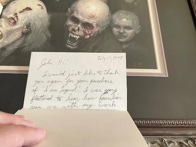
On June 9, 1995, for the first time in my life I was able to walk into a bookstore and pick up a brand new copy (well, two copies, as the receipt below shows) of Richard Matheson's I Am Legend (along with a selection of his short stories — the lack of any mention of that on the front cover leading to confusion with some readers new to the book, as a few who were lost when the story suddenly shifted gears into a different tale reached out to me through the Archive website for clarification!).
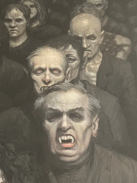
I was immediately taken with Jim Thiesen's cover art. It doesn't attempt to depict a scene from the novel (which he had not even read!), but it manages to communicate the book's epic scope of a world filled with vampires. If it was available, I had to have it.
Easier said than done. In the pre-internet age, it meant writing a letter to the artist, care of TOR, and putting that in the US mail. Much to my surprise, within a few weeks I received a phone call from the artist's agent, who communicated the price (while on the call I separately managed to coordinate a loan with my Dad that would cover the delta between the asking price and my meager budget) and agreed to the purchase.
From my years spent working in the bookstore, I was already familiar with Jim's work, if not his name, before he painted the I Am Legend cover. He is recognized today as a fan-favorite of 80s horror paperback (referred to these days as 'Paperbacks from Hell') artists.
Seeing the original painting was a revelation. So much detail was lost in the reproduction; there's personality to be found in every face, including those receding into the horizon. I apologize that the photos below cannot do the original artwork justice (it took many attempts to get decent shots without reflections!), but you can at least appreciate some of the finer details in the painting.
A few years later, when TOR/Orb reissued the collection as a trade paperback, they once again utilized Thiesen's art, however it was given a heavy-handed PhotoShop shellacking — tightly cropped, blurred, vampire baby painted out (I assumed due to the new cropping), and a skull-faced vampire's head relocated over the clutching vampire woman's face. To the untrained eye, it may still seem like an effective cover, but the revision was done without consultation of the artist (whose name was omitted, as the cover is solely credited to — I kid you not — The Chopping Block!). I brought this to Jim's attention, as this cover would go on to be used in different regions of the world, sometimes further cropped, recolored, and for better or worse, often solely crediting Thiesen.
 |
Thankfully, it doesn't prevent me from appreciating the art in its original, unmolested state, whenever I'd like. I'm pleased to call Jim a friend, going on 30 years now. The cover remains a personal favorite of mine, second-only to Stanley Meltzoff's painting on the original Gold Medal paperback (we'll get back to him soon enough). And that's not faint praise when you consider that I own more than 200 different editions from around the world. As I slowly get those all online, you'll have a new appreciation for the phrase, The Good, The Bad, and The Ugly.
Be sure to check back next Monday for more from the I Am Legend archive!


No comments:
Post a Comment